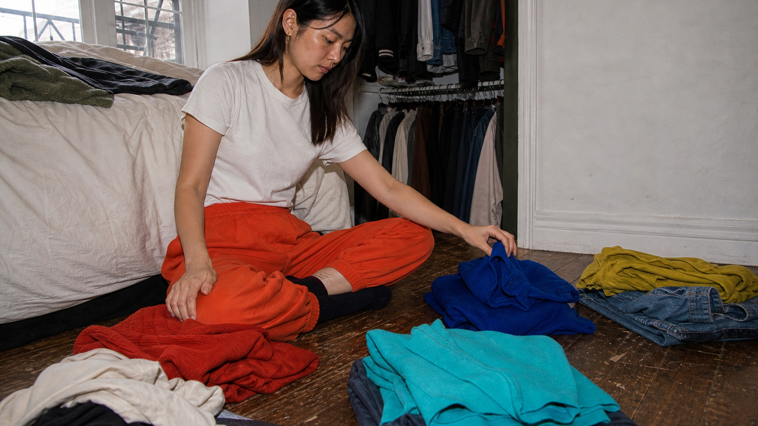
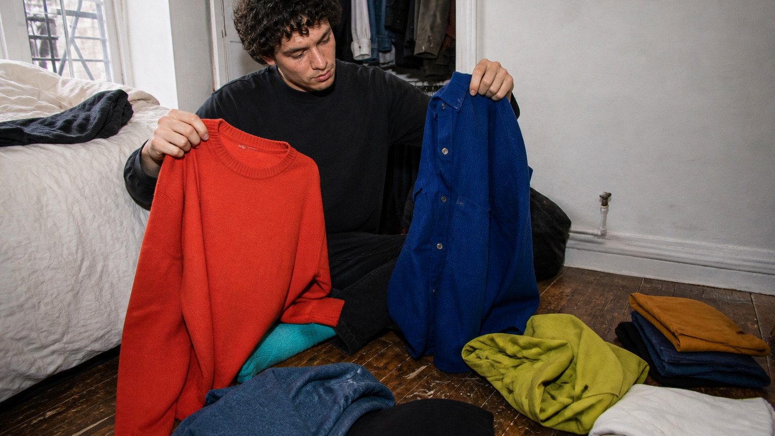
Start with one garment you already wear, place two or three possible companions beside it in the same light, and describe the relationship you see: lighter or darker, quieter or stronger, closer or further apart. Keep the combinations that feel useful in context, and leave the rest unlabelled. This is an owner-led comparison, not a diagnosis, a universal palette or a promise about what looks best.
Begin with one familiar garment
Choose an anchor piece you know well: a jumper you reach for, a pair of trousers that already works in your week, or a shirt whose colour feels settled. The aim is not to discover your whole palette. It is to make one concrete comparison less vague.
Compare only a few companions
Lay two or three pieces beside the anchor. More options rarely make the first observation clearer. Use plain language before reaching for a label: one piece may feel darker, another may feel sharper, another may sit nearer in intensity. These are descriptions of what you see in that moment, not rules about harmony.
Name the context
A comparison changes when the context changes. You may be deciding about a work day, a dinner at home or an ordinary walk; write that down in a few words. The context is not an occasion formula. It simply keeps you from treating a small observation as a verdict on every possible use of the garment.
Use a two-pass stop rule
On the first pass, describe the relationship without deciding whether it is good. On the second, choose one of three actions for that context: keep the pairing in mind, revisit it later or leave it unlabelled. The last option matters. A comparison that does not help does not need to become a tag, a palette or a purchase decision.
Let material stay in the picture
Colour is not the only thing you notice. A matte knit, a crisp cotton shirt and a shiny fabric can change the impression of two similar shades. CIE’s visual-appearance framework also separates colour from other attributes of what is seen. Notice material if it changes your comparison, but do not turn that observation into a score.
What this does not determine
This exercise cannot assign a season, identify an undertone, decide which colours suit you or produce a universally correct pairing. It does not account for fit, body type, trend or price. It also does not claim that retaining a pairing will improve an outfit or reduce shopping. It is simply a way to look at a few clothes you already own.
Sources and method
CIE publishes technical vocabulary and a framework for visual appearance; the National Gallery of Art provides educational material on colour as an element of visual observation. Those sources inform the language of this article. The anchor, companion and context card remains CLOOTHE editorial guidance rather than a colour-assessment service.